Bhutan unveils new national branding

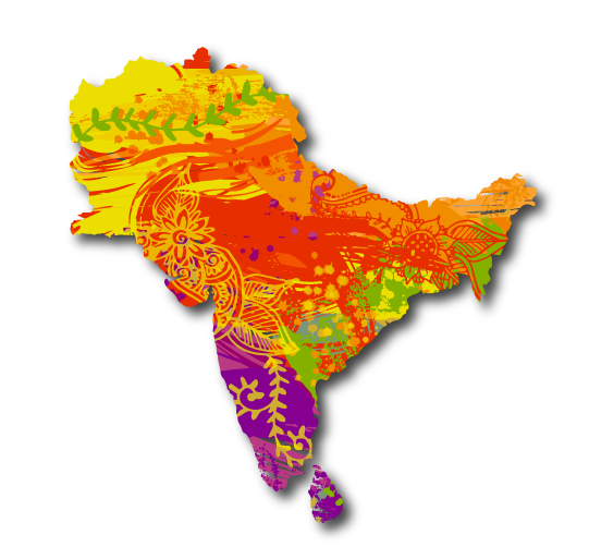
Bhutan has developed a new national brand identity as it reopens to visitors after more than two years. With help from London-based branding agency MMBP & Associates, the new graphic identity draws on vibrant yellow and orange colours from the Bhutanese flag along with traditional Bhutanese iconography such as hand-painted architectural decoration, mythical animals, folklore and symbolism.
The rest of the colour palette is said to be inspired from nature, including the green of cypress forests that cover 70% of the country, the blue of Bhutan’s national flower, the Himalayan blue poppy, and a soft black inspired by natural soot from the home fires from hearths throughout the kingdom.
Centred around the word “believe”, the new brand uses a colourful, kaleidoscopic style featuring traditional symbols in bold, bright tones.
A new website was also launched as part of the rebrand. This provides information for travellers about planning a trip.
What is ‘Nation branding’?
As a practice, branding isn’t new but is typically used in corporate settings to promote businesses.
Nation branding (also called place branding), uses the same techniques to promote a country, not just to attract tourists but capital and talent or build its reputation. Countries have done this since the 1990s but the technique has become more popular in recent years.
Where to next?
The latest in Travel, landing in your inbox every week.
Today, nation brands can even be judged by official intuitions like the Anholt-Ipsos Nation Brands Index, which found Germany to have the strongest brand in 2021.
Some brands become exponentially famous, like Amsterdam’s “I amsterdam“, which was so popular the “I amsterdam” sign was removed from Museum Square after it caused constant crowds. Others, like the “Best Small Country in the World” campaign by Scotland, lasted just a few years.
Whether it’s an extensive tourism strategy or a simple slogan, for a small suburb or an entire country, the goal is always the same; to shape people’s perceptions of a place.
This isn’t Bhutan’s first brand. For years the nation promoted tourism under a campaign called “Happiness is a Place,” playing off its reputation for having a Gross National Happiness index. In 2018, “Made in Bhutan” was launched as a way to advertise the country’s export industry.
The challenge with nation brand is that, in order to be successful, it must streamline the complex, multi-faceted identity of a country into a single, clear idea. One you can easily communicate by a single icon, slogan or visual. As a result, nuance is removed and places are often portrayed according to their strongest attribute; tourism.
Over four months, MMBP & Associates attempted to create a brand identity that resisted this silo.
MMBP founder Julien Beaupré Ste-Marie told Fast Company the re-brand attempted to communicate two messages to two different audiences. First, that Bhutan was back open and ready for international tourists. And secondly, for young Bhutanese to resist the temptation to move overseas.
( Input from Campaignasia/nzherald)


Facebook Comments